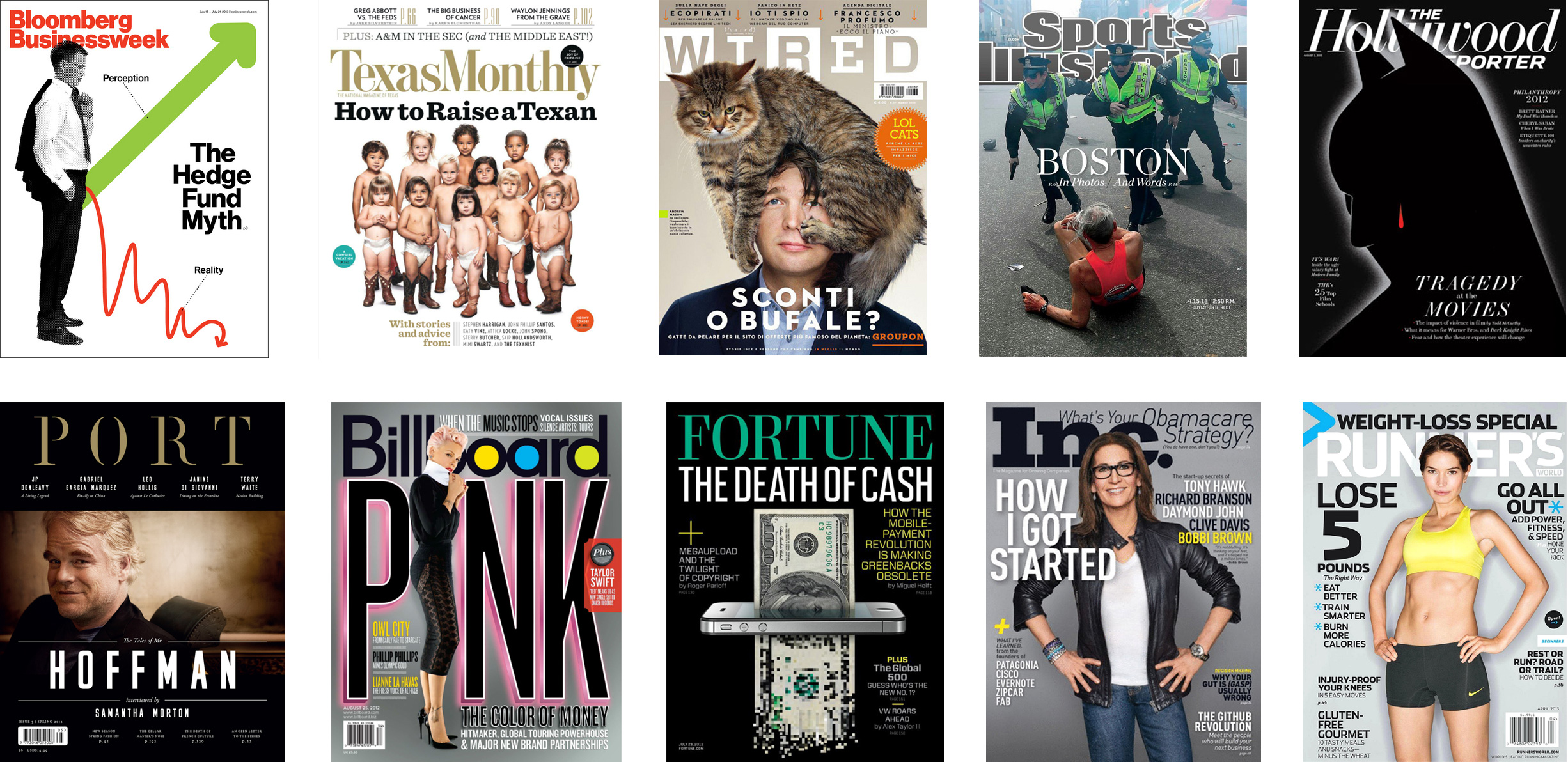
The way we consume magazines has changed slightly, but the purpose of the magazine cover design hasn’t. It still remains the front door for repeat sales and subscriptions. A great magazine cover helps drive sales on the newsstand and in app purchasing by being intriguing and creating desire and interest at a glance.
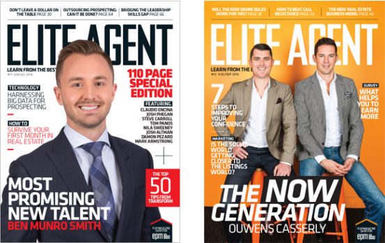
On the newsstand, magazines are generally stacked on cascading shelving systems, one in front of the other from top to bottom. This way of displaying magazines has led to a standard format for the use of mastheads as differentiators. The masthead appears at the very to so as not to be obscured by other titles. Each magazine jostling to be seen amongst the mountain of choices, the current issue of favour needs to be easily found before another piques the interest of the consumer.
Masthead position isn’t so important when selling through a magazine app store. Here they’re displayed in a different way but if your magazine is to be sold in print, it’s a good idea to stick to the norm – even though you’d like to be different to create a point of difference to the competition. Don’t step too far from convention unless your title is highly unconventional and your readership will dig for you to find the magazine before another title catches their interest.
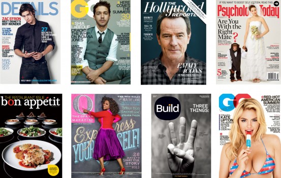
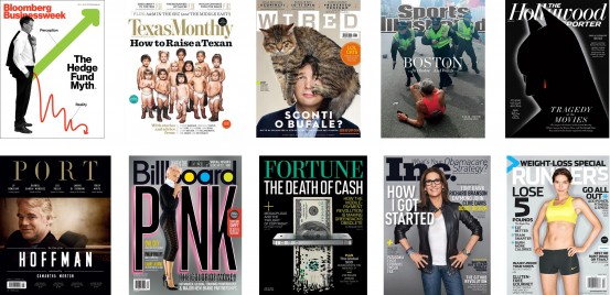
A great magazine cover design needs to have an arresting combination of imagery, art direction and interesting cover lines. This combination shouldn’t scream at the consumer (well, not always) but should be refined and considered with the image, cover lines and masthead all working together.
The magazine cover design process usually starts with the art director or graphic designer seeking out a captivating image, whether it be photography or illustration. It has to have impact! It needs to stop you in your tracks. The calibre of imagery is hugely important. You should never use a sub standard image just because it represents the main feature in the issue. If you must have the feature story as the cover story, ensure the image is captivating and creates interest. If it’s not, get it shot or use something else.
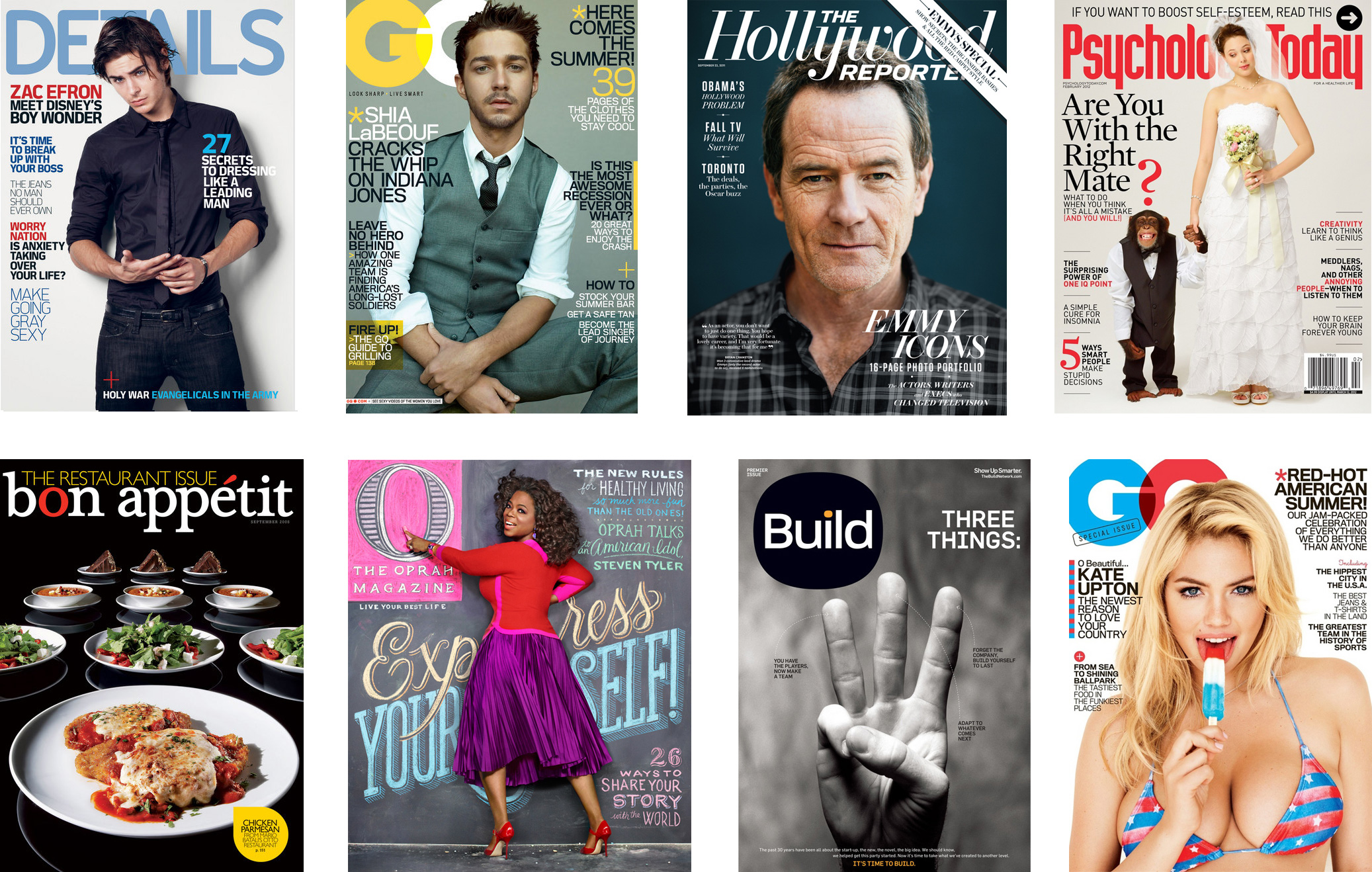
When featuring people on the magazine’s cover, there are several things to take into consideration. Firstly, what feeling are you after? A full body shot is descriptive and allows for plenty of cover lines. As you zoom in, the image becomes more and more intimate as the subjects head starts to fill the page. The reader subconsciously becomes more emotionally connected to that individual.
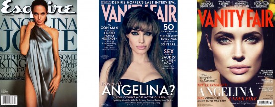
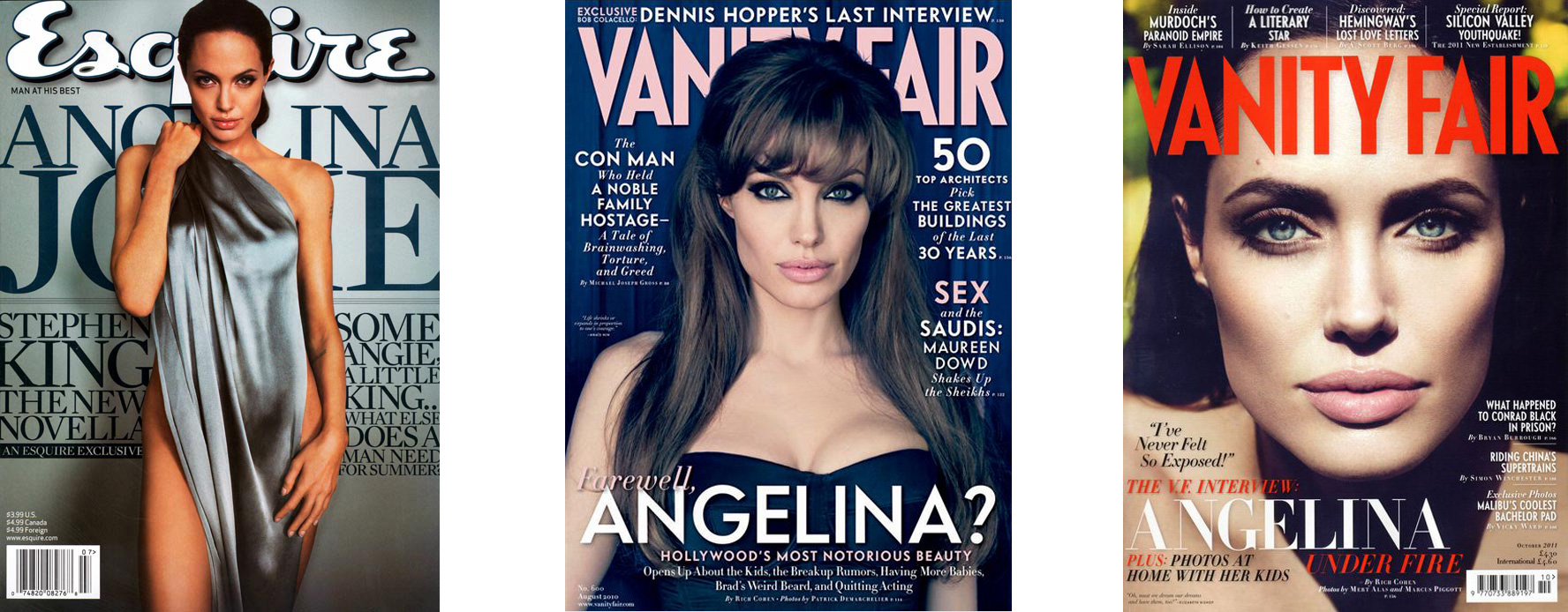
Another thing that creates connection and intrigue on a magazine cover is eye contact. If you look at magazines on the newsstand, you’ll notice that almost all human subjects are looking bang on into the camera. They connect. When I was doing my thesis for my illustration major, I interviewed a wildlife illustrator. He taught me about eyes. They’re so important. When you look at an animal, you look straight into it’s eyes to judge if it’s going to be kind or if it’s going to attack you. That’s human/animal instinct. And that’s what we do. We look for eyes to connect with.
Another important thing when art directing the cover is ensuring you have copy space, or rather, areas where the graphic designer will lay cover lines and the masthead. When having the cover image shot by a photographer, ask them to pull out and give background space, especially if there’s a scene in the image. You don’t want to go to the time and expense of having the cover extensively retouched when all the photographer needed to do was zoom out.
If there is a background, how will it work with cover lines? If there are areas of brightness next to darkness, it’s very hard for the designer to lay cover lines over that area. A white cover line will sit on black just fine but when the word hits an area of lightness, it disappears or becomes difficult to read. And if you try to use colour to have the cover line sit on both, it tend to recede. So when shooting the image the background is a major consideration. For best results use an even tone throughout the background if you can or give thought to the composition to create areas for text to sit on.
Cover lines help sell the benefit of purchasing the magazine, showing what stories await the reader. At a glance, the consumer can see what they’re in for and see if there’s something in particular in that issue they’d like to read more about. Editors tend to write cover lines to be impactful and grab attention. Some editors even go so far as creating cover lines which allude to something that may not be true without actually stating that mistruth as fact (yes, that’s you New Idea, Who, OK, etc. How many times have Brad and Angelina been getting married in your pages?).
Cover lines add interest to the cover through typography, creating a feel and aesthetic relevant to the subject matter. Typography is a subject for another time but font selection, scale, colour and composition all sit in the graphic designers bag of tricks to create a stunning cover.
So don’t treat the cover as an afterthought following a long and arduous month putting the content and internal design together. Give it the love it deserves and make it memorable. And surprise the reader with something different every now and then. That’s how you keep them interested.